
Do’s and Don’ts of Modern Web Design | ncorde
When you start creating a website on nCorde or hire a web designer to create one for you, there are specific items you need to be mindful of. The people who come to your website do not read your web pages in the same way they read books or other print contents. Online Users today are very selective when it comes to the content of their favorite websites.
See: How to Create Good and Effective Web Content
By keeping your website’s design clean and simple and your web copy concise you can greatly improve your chances of effectively impacting more users. As web professionals it’s our job to steer our clients in the right direction. And guide them on the right path of creating a successful modern web presence.
Seizing the attention and interest of web users is very different than for other types of media.
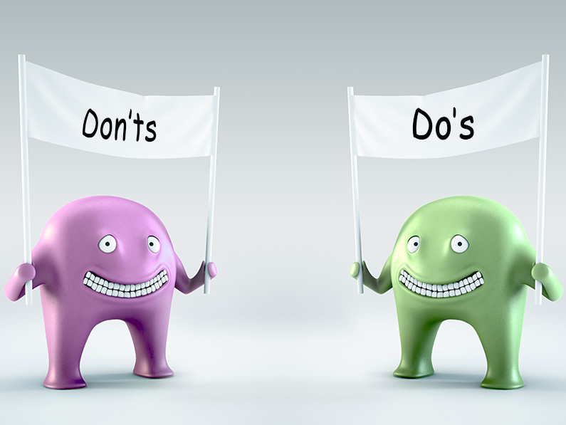
Below are do’s and don’ts of effective modern web design. It will help either make or break your website.
Things to do:
DO: Use light typeface to make your website look more modern
One way to show users that your website is modern and up-to-date is to use a light typeface. Users who visit your site will get the impression that your brand is hip and cool if you use a light typeface right. However, don’t go crazy and use it on everything because of its application. You should never compromise readability for aesthetic’s sake.
DO: Focus on what’s important
Are you building a website for a business that sells one specific product? If so, make sure that’s the focus of the home page. Allow yourself space on the inner pages to place calls to action for that specific item. If you’re building a blog that gives out freebies or writes tutorials, make sure they’re getting the proper amount of focus and attention.
DO: Keep your pages structured
Focus on what’s important and provide a logical order to your website. Organize your website’s content to make your page easier for visitors to use. Sometimes following after the structure and balance of a great magazine/newspaper will give you efficient lay-out for organizing information in a structured and easy to follow format.
DO: Establish direction through your site
Make your page easy to navigate with clear direction throughout each page of your website. Utilize noticeable calls to action to help users find what they are looking for, and move from page to page effortlessly. You’ll want to make your navigation easy to spot and easy to use.
DO: Keep it simple
From copy to content to design, keep your website simple! Use effective copy-writing to make your points clear in as few words as possible. Basic navigation and design will improve usability of your website. People don’t like doing things for too long – so don’t over complicate things. Make things as easy as possible for your readers.
DO: Make it easy to scan your pages
Web users do not spend a lot of time reading a web page. They want to quickly find what they’re looking for, scan it briefly for keywords that relate to what they need, and get out.
The best way to ensure you’re getting the right information out to your reader is to make the page easy to scan.
DO: Shape your content strategy
Your content is the most important thing to consider. Keep them short, sweet, and to the point. If you have trouble writing a copy that attracts the reader’s attention to where you need it to go, hire nCorde. A copy is just as important as the design of your website.
“Content which is well-planned and consistently executed can raise sales and profit margins, lower customer complaints, and decrease the workload and stress levels of your content creators” Learn More
DO: Optimize your load times
You need to build your website with optimal speeds and allow your pages to load as fast as possible. You can do this by making sure your css files are compressed, using the google hosted javascript files and ensure your page is coded and designed with optimal speeds in mind.
DO: Make your page visually modern
Utilize textures/gradients that give your website depth and draw attention to the beauty of your design.
Imagery is obviously a powerful tool in establishing a design direction. Good quality, professional photographs of your office or your range of products are going to impress your visitors on your website? You need a high standard of photography in order to gain the trust of potential customers. From displaying your premises to its full advantage to showcasing your products and services. nCorde Photography Services
“ It’s no longer enough to have a website on the internet , it must be a good-looking website. Your users will be more likely to return back to your site when your design is clean, strong, and simplified.”
DO: Choose the right colour scheme
By Knowing what your reader’s emotions are will help you in choosing the proper colour scheme. We know Colour is a powerful tool in communication of personality and in grabbing user’s attention. Underlay a huge amount of research in the selection of your colour scheme.
DO: Choose the right fonts and sizes
You will surprise your website visitors by using the most beautiful Typography in the world. Making your section titles the right size and making sure the fonts you’re using will greatly affect the experience your visitors have when viewing your websites. Generally speaking, you should use one main font for the content and then you may switch the titles of the pages to a different font.
Thing not to do:
DON’T: Make your users search to find something
Get your patrons in and out of your website with as little hassle as possible! If users are trapped having to search for content on your website they can easily become frustrated and leave your site, or hold this negative experience against your brand.
Your visitors shouldn’t have to click through three pages just to get to a sign up form. Get the important things out in the open.
DON’T: Stuff your pages full of keywords
Google isn’t stupid. Neither are your readers. If your page has the main keyword for your site stuffed into each paragraph more often, it will not only read very poorly, but you’ll be penalized. Writing should flow naturally and should only mention your keywords where they fit.
DON’T: Overdo it with too many colours
There can definitely be too much of a good thing. Don’t crush your visitors with a flood of colours that can be seen as unattractive and overwhelming.
Having too many different colours on your screen will not only look bad, but it will annoy your readers and drive them away. Your colours should blend well together, not clash.
DON’T: Place irrelevant ads across your page
If you’re going to try and make money from your website/blog, do yourself a favour and lay off the excessive advertisements. Try blending them in and making sure they don’t take away from the content.
DON’T: Fill your pages with excessive pictures, copy, and content
Excessive amounts of pictures, copy, and content on your website can make your page cluttered and difficult to use. Make sure each element to your website is adding value. When in doubt, less is more.
And don’t hesitate to let us know of anything we might have left out, in the comments below. We love getting your opinions on things and discussing the articles with you – after all, you’re quite possibly the coolest people in the world.