
Minimalist Design | ncorde
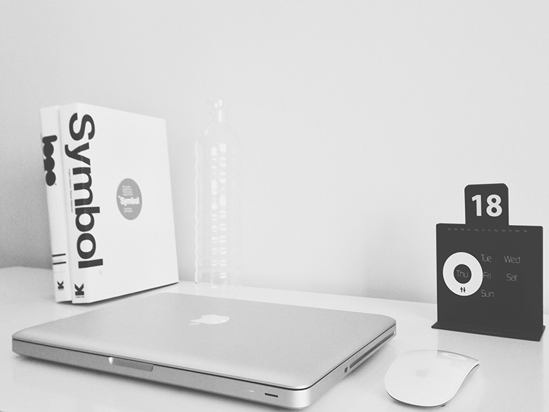
Minimalism is a word I’m sure you’ve heard before. It often gets thrown around on design blogs though sometimes carelessly as though the term just means to put less on the page. The term minimalism is used to describe a trend in web design where the subject is reduced to its necessary elements and that is characterized by extreme spareness and simplicity.“less is more” minimalist design.
Minimalist designs have been with us for quite some time now. It is easy to spot all over the place as everybody wishes for such a design and everyone is looking to have it. People pay lots of money for redesigning their websites to go with this trend and minimalism seems to be everybody’s direction right now.
There is a lot of skill and hard work required to design a “less is more” minimalist design. Some don’t understand there is more involved in creating this type of design than a busy layout. I do believe designing minimalist websites improve website’ readability. 2012 is the time for minimalism to shine. It is indeed time to only show the information which really needs to be shown.
Minimalist designs bring in a friendly environment without clutter and confusions. Web pages are now easy to look at and are quick to analyze even by an untrained eye. After so much time of the old web era, people kind of had enough with web pages that were nearly impossible to grasp. So there is indeed a reason why minimalism is so popular.
Minimalism is about designing smarter, doing more with less, and reducing design to the fundamentals, which relies on getting basic design principles right.Here’s how a designer achieve a minimal web design.
For a designers the design process comes down to the following 7 areas.
- Grid
- White Space
- Flow
- Colour
- Typography
- Texture
- Imagery
Minimalism is reducing design work to the essential and using less to do more.
The Basics and Why Do It
When a visitor comes to your website he or she does not expect to see super interesting visual effects and extraordinary menus. What he expects is to find useful information strung in a manner easy to understand.
some reasons why its good to use minimalism in your next web design:
- It looks more organized – When we build a website for a company, the message must be clear, concise and has to generate impact. This is why the design should be as neat, tidy and as simple as possible. This can only possible by using a minimalist style.
- It looks more professional – A minimalist website design transmits trust to the visitor because in this kind of design are used only the most necessary elements, without filling the website with other useless materials. This way, the website looks more practical and more reliable, giving visitors the impression of “short and to the point”
- A website with a minimalist web design is easier to understand – The purpose of a website is to ensure that the information about that company is understood by visitors, visitors who can become clients. With minimalist style, the designer ensures that the information presented on the website will have all the visitor attention.
The goal of any corporate website is to leave the visitor a good impression about the company, encouraging the visitor to act – to buy the products or to use the company services. Using the minimalist style in corporate web design, the website is able to meet almost all the visitor expectations, offering clarity, credibility, understanding and impact.
To achieve a minimalist web design is not exactly easy, designers must understand visitor needs and we have to know some basic design principles incorporate web design about how to implement the website according to the company activity.